


Logo-brious
12/7/11 3:38AM
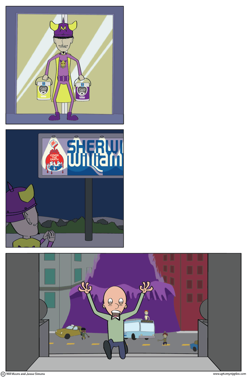
This joke might suffer from the average reader not realizing the logo really and truly is the logo of Sherwin Williams. Hell, I don’t think Sherwin-Williams themselves realize it. Or at least they must not have any PR men studying it. The implications of that logo along with the slogan as a company mantra are an eco-friendly nightmare. And what hell kind of gravity is at work there? They’re taking the round and flat earth models and combining them in the least sensical way.
In a week of big website changes (twitter/bonus-button), we’ve made an even bigger change: a beautiful new graphical archive. Compare new to old. I dare you to tell us it’s not a vast improvement. Though, I’m worried about its appearance on certain browsers. Also, with all the images, there might be some slow down. Please, let us know in the comments if you’re having any trouble with it.
-Jesse

Up To My Nipples by William Moore and Jesse Simons is licensed under a Creative Commons Attribution-NonCommercial-NoDerivs 3.0 Unported License
Change is bad, I like the status Quo
do not change
yeah, the old one was better? how come?